Mood board
BackgroundOnce the story line is well in hand, one of the first things you will want to do is create a Mood Board. Mood Boards are used to define the look and feel of major projects (e.g a video, web site, booklet, etc.). It doesn't make much sense to use a mood board for a single image so it is primarily a tool where a project has multiple pages or screens or video clips.
A mood board is a page that defines and illustrates your choices of colour, typography, images, etc.. It is a collage of elements that communicates the mood and tone of a design. It is not a mockup or prototype of a particular page or screen of your project. It is expected that you will experiment with different combinations as you create the mood board but the final representation should be your finalized results. It can and should include text, including the style of titles, headers, quotes and body copy. However, it is primarily visual so it should include sample images, the colour palette and colour combinations. If this is for a video, the kinds of transitions could be listed, even though you may not be able to show those dynamically on the Mood Board. In theory it could stand alone without the need for explanation (French, 2014). However an explanation of your choices is beneficial. For instance, this could be articulated in an Activation Matrix (Steed, 2006).
Below is an example created by the author for the development of a web site: Example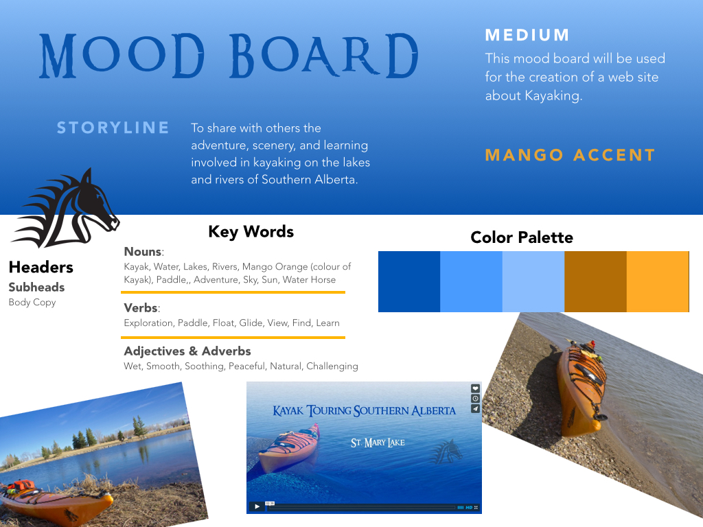
Design Rationale:
In the example above, the complimentary colors come from the kayak (mango) and water (blue). The blue gradient provides the audience a sense of sky or the horizon line on water. In either case it will activate knowledge about the outdoors. The title font is Ringbearer based on the movie Lord of the Rings and links to the concept of adventure. The rest of the fonts were selected for legibility and readability. The heading font is standard sans serif with rounded lines which reflect the rounded lines of the kayak and water waves. To address readability. the header and and sub-headers are set in larger type sizes, bold and black to emphasize the levels of hierarchical structure of the information. The body copy text is a dark grey sans serif to provide sufficient contrast on a white background and smaller than the headers but large enough for legibility. The logo of the horse represents a connection between the authors name (Steed as in horse) and water (the flowing lines of the logo). This emphasizes the connection between the content (kayaking) and the person creating the web site. It is black to provide contrast when put on the mango or blue backgrounds. Black also suggests an artistic inky creation, reminiscent of the native american art designs of the west coast where water navigation was a primary way of travel. Mango orange is used as a highlight colour and contrasts with the blue and white. For instance, orange dividers will highlight and delimit different sections of information. Here is a link to the resulting web page: |
PurposeA mood board is a test to see if your design choices work together to create the right tone. It proves the visual direction for creating prototypes.
PreparationMake a list of adjectives that correspond to the subject, then look for colours, type faces, and images that match. Stock photo sites allows search by words, shape and color. Pinterest can be a useful tool. You might opt to take your own photos that link to your idea. Think of yourself as a curator rather than a collector. Sometimes it is useful to identify an object that inspires the overall design (e.g. a fruit) and then the colour palette and even font style can play off that piece of inspiration.
ComponentsBelow are components that should be a part of a Mood Board:
ToolsHere are some tools that can assist the creation of a Mood Board
|
References
French, Nigel. (2014). Developing a mood board, Lynda.com. Retrieved from http://www.lynda.com/Design-Color-tutorials/Developing-Mood-Board/
Steed, M. B. (2006, July). Attribute activation: An approach for learning visual representation. Proceedings of the 33rd International Conference and Exhibition on Computer Graphics and Interactive Techniques; SIGGRAPH 06. (Proceedings DVD) Boston, MA. (peer reviewed) Retrieved Jan 9, 2007 from http://doi.acm.org/10.1145/1179295.1179336
Steed, M. B. (2006, July). Attribute activation: An approach for learning visual representation. Proceedings of the 33rd International Conference and Exhibition on Computer Graphics and Interactive Techniques; SIGGRAPH 06. (Proceedings DVD) Boston, MA. (peer reviewed) Retrieved Jan 9, 2007 from http://doi.acm.org/10.1145/1179295.1179336