Positioning
BackgroundThe positioning of elements is crucial to how viewers will process a visual portrayal.
Placement design errorsHere are some design choices to avoid in regards to the placement of elements on the layout:
scan orderHere is the order in which the eye processes visual forms:
ExtremesIt is okay to experiment with extremes in positioning if there is a purpose. For instance, the layout can bleed off the page if that is the technique used to gain interest or communicate the message. If the tone is sour, go over the top sour - ensure there is no doubt about the message.
Be brave, be bold! Consider the image below where the subject of the image is off center and at an odd angle to add interest and makes the image more dynamic:
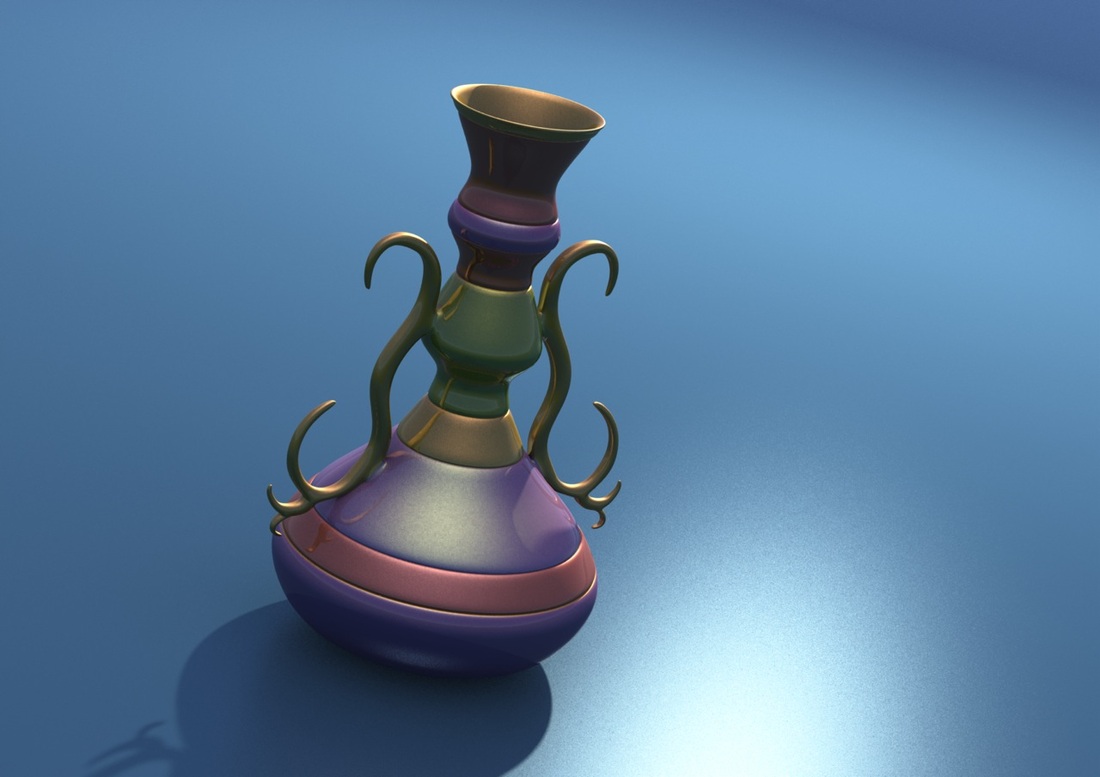
Off Centered & Odd Angle (1)
Image drivenOne approach to layout is to let the story drive the layout; make the images the size and shape needed to communicate the story and the text positioned around the pictures. For instance, the text could mirror the shape of the image or playoff that image; there should be a marriage between the words and the image.
ProximityThe distance between elements also communicates information. A close distance suggests a relationship or possible comparison. More distal elements are more likely to be viewed as less related to one another or suggest divorce or lack of connection or communication between elements. Consider how the following Figure and how the proximity of elements: suggests a grouping based:
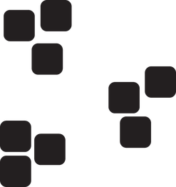
Grouping (1)
Consider the following slideshow as a more practical example. The distal text makes a connection with the image questionable. However, text overlaid on the image makes the linkage between those elements stronger.
directional spaceWhen composing elements, it is generally useful to leave space in the direction action may be taking place or will take place. For instance, leave room in the direction a person is looking or leave space in the direction an object may be moving.
Potential Movement (1)
Leaving space to the left of the ball in the previous Figure suggests it potentially might move in that direction.
Alignment & OrientationAlignment of elements, or lack thereof, communicate meaning. Consider the following Figure. How might you align these elements to convey different meanings?
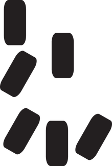
Random Orientation (1)
|
PurposeThe positioning of elements communicates information about the importance and relatedness to other features.
Grids to create balanceIt is useful to use geometric shapes as the basis for layout design and positioning of elements.
Grids can be a way to help establish balance in compositions, even if that means elements are not perfectly symmetrical. Grids can provide guidelines for consistency of balance and structure (Kristoff & Satran, 1995). A grid system defines borders of blocks of text and placement of images. One advantage of a grid system is that it provides a consistent location for particular information (Lohr, 2003). For instance, if one were designing a web site that had a home button, it would be best if it were in the same location for each page. That way, the users would not have searched for it every time. A grid system often defines areas for headers, content, practice, feedback and navigational tools. In this way, the audience does not have to relearn the layout each time they encounter a visual version. The following slideshow in the Figure below illustrates how a grid places elements, note the final image removes the gridlines and would represent the final product. Grids are not meant to be prison walls but a guide.
A grid needs gutters; spaces between columns. Experiment with grids, create duplicate pages of the layout and explore variations and see what looks the best. Page Layout Terminology
Use grids selectively; it will not always be the best approach. Rule of ThirdsThree is a pattern that is pleasing to the eye, so it works well in the composition. Divide the frame into thirds and use the intersection points as focal points in the layout. Put the horizon on the upper or lower third of the frame and put the subject as a focal point on one of the intersecting lines; this adds "looking room" that makes the image more comfortable to have space in the direction the person is looking. The slideshows below illustrates how the rule of thirds would work with composition:
Use the underlying guide to place elements on the layout. Don't be tempted to put elements back into the middle.
Golden SectionThe golden section is a relationship of 1 to 1.518 and is a way of visually laying out elements in a pleasing manner for the eye.
Use the golden section as an underlying guide to place elements in the layout. To use the golden section, put the focal point of the image underneath the structure's apex and try to place the subordinate elements along the lines. The result is a harmonious form. It isn't meant to be a straight jacket - just a guide.
|
References
Adams, Sean. (2013). Foundations of Layout and Composition, Lynda.com. retrieved from http://www.lynda.com/Design-tutorials/Foundations-Layout-Composition/
Kristof, R., & Satran, A. (1995). Interactivity by design: Creating and communicating with new media. Mountain View, CA: Adobe Press. ISBN:1-56830-221-5.
Lohr, L. L. (2003). Creating graphics for learning and performance : lessons in visual literacy. Upper Saddle River, N.J.: Merrill/Prentice Hall.
Kristof, R., & Satran, A. (1995). Interactivity by design: Creating and communicating with new media. Mountain View, CA: Adobe Press. ISBN:1-56830-221-5.
Lohr, L. L. (2003). Creating graphics for learning and performance : lessons in visual literacy. Upper Saddle River, N.J.: Merrill/Prentice Hall.