Harmony
BackgroundHarmony or "stylistic unity" is a consistency of style that helps communicate the message. Harmony often uses an echoing of style or common features of elements (it is not the repetition of whole elements per se). Usually, this uses one design feature in a consistent manner across elements.
Exemplar: Consider the movie/book Lord of the Rings and think about the stylistic unity between the elvish architecture, typography, clothes, and weapons; stylistic unity is in the sweeping lines. The delicate and intricate artwork communicates harmony and belonging to that culture that is communicated by those design choices. Consider how that contrasts with the dwarf themes in The Hobbit. 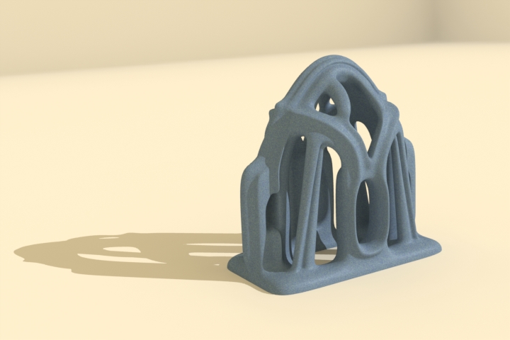
Elvish Architecture (1)
Stylistic UnityStyle
Style is the form of representing ideas. The style suggests the intent communicated by the look and feel of the elements. Stylistic Unity Harmony of style suggests that the form of expression persists over time. Often movies will have a stylistic unity that makes the elements link together even though those may be separate items. Cognitive LoadThere is yet another subtle reason for stylistic unity, one that is difficult to articulate. Competing visual styles create visual clutter, causing the information to be more challenging to process. From a cognitive perspective, this makes sense because each style will activate different knowledge structures, and the additional knowledge structures would compete with each other for cognitive attention. If there were too many different styles or used inconsistently, this could lead to confusion.
A consistent thematic style tends to have an aesthetic appeal. Our minds like things that are consistent and organized; visual unity can communicate that. A sense of harmony between elements tends to unify the image/video/presentation into a whole - providing a gestalt.
Skaalid (1999) suggests three design strategies to encourage visual unity:
Consider how the following Figure illustrates harmony: 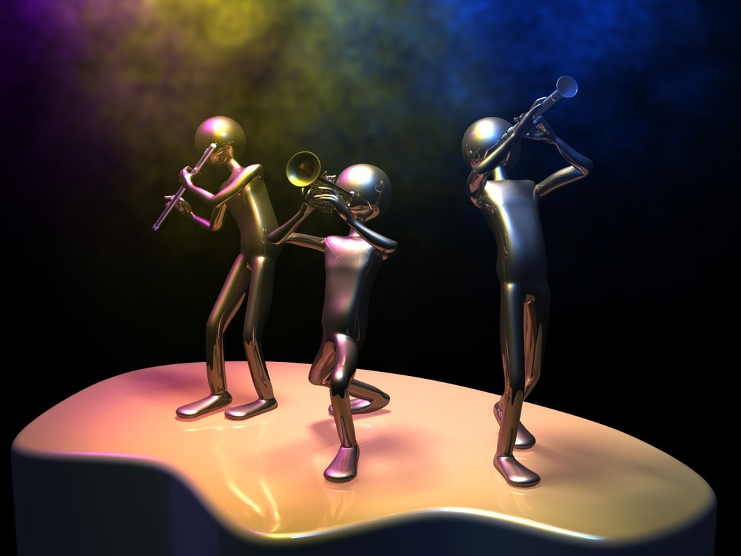
Rckn Jm (1)
ResourcesHere are links to additional information on style and consistency:
|
PurposeHarmony provides a pleasing solution that brings disparate elements together in a coherent whole. It is a way of communicating a grouping of things that go together even though those elements may differ.
Style GuidesStyle guides refer to a set of standards that a company or institution will employ to encourage consistency across an organization or company products. For instance, the University endorsed a set of Logos. Over the years, numerous logos have come and gone and morphed over time. As a consequence, different departments were using other logos, and the University wanted a consistent face for the University. As a consequence, a brochure with style guidelines was published. The Figure below illustrates how the Faculty of Education version looks:

U. of L. Logo
One might create a personal style guide for a document, image, video or presentation. These are conventions to guide the look and feel of visual or auditory creations.
Consistent visual style sets apart a professional-looking image from one that looks like it was thrown together. There are at least three ways that visual style impacts communication:
Thematic Unity ActivityDeconstruct the image in the following Figure for visual style.
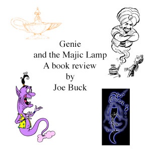
Inconsistent Visual Style (2)
The previous Figure is the standard approach most students take in illustrating concepts. The method is logical (in a sense); they look for images that strike their fancy and relate to the topic. In the worst case, it doesn't even relate to the concept. One might argue that consistent style is not essential, it is the concept that is important, but is that true? Deconstructing the image will help illustrate the problem.
In the case above, the student would probably have been better off selecting one image that matched the book's theme rather than multiple images that provoke competing interpretations. This change helps the audience activate similar knowledge structures with a unified understanding. See the following slideshow to see a potential fix: |
References
Kristof, R., & Satran, A. (1995). Interactivity by design: Creating and communicating with new media. Mountain View, CA: Adobe Press.
Lohr, L. L. (2003). Creating graphics for learning and performance : lessons in visual literacy. Upper Saddle River, N.J.: Merrill/Prentice Hall.
Massironi, M. (2002). The psychology of graphic images. Mahwah, NJ: Erlbaum.
Skaalid, B. (1999). Web design for instruction: principles of design: unity. Retrieved Feb 21, 2004, from http://www.usask.ca/education/coursework/skaalid/theory/cgdt/unity.htm