Texture
BackgroundTextures are the feel and consistency of a surface. It is the roughness of the surface, the specular highlights, subsurface lighting and the reflectivity.
Textures can be used for negative space and provide that space with context. It can make the space more interesting for the viewer and enhance the message. There are multiple ways of obtaining useful textures. The following sections will outline a few ways to do that: Texture as REPETITIONOne way to create a texture is to have a relatively small element repeated. See the following two images as examples:
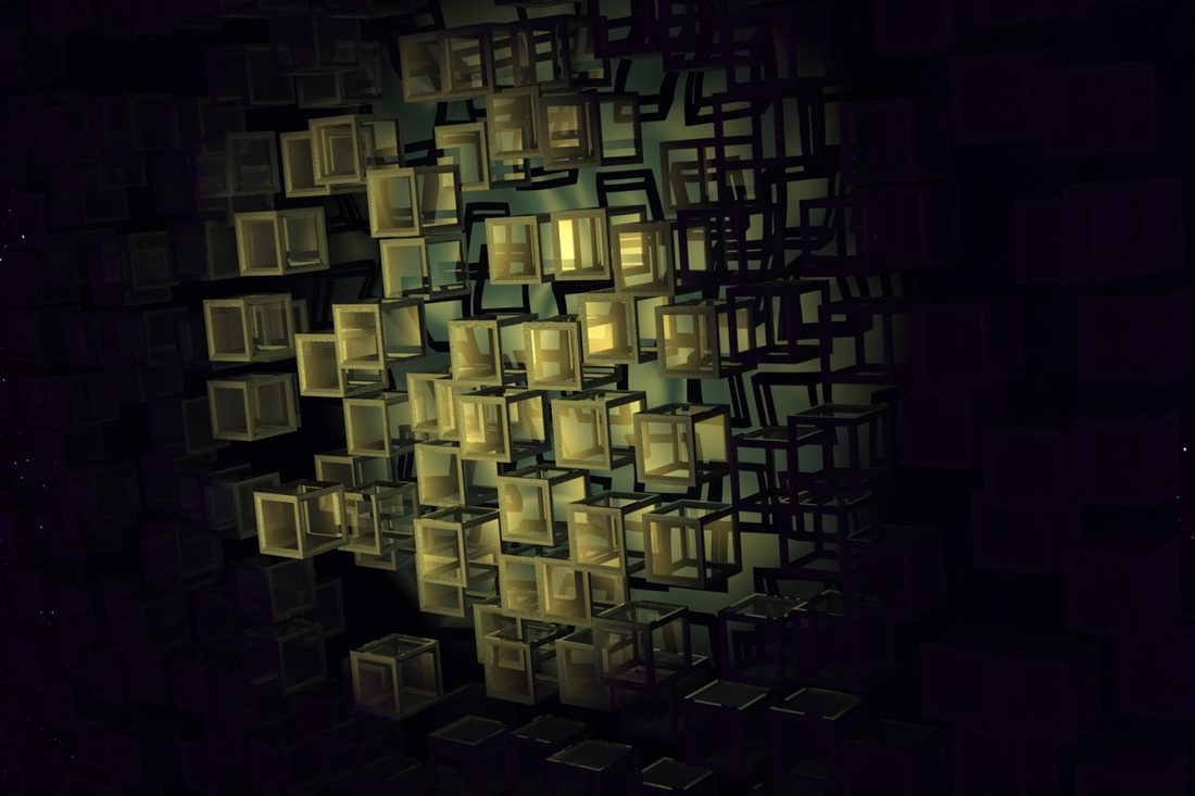
Repeated Boxes (1)
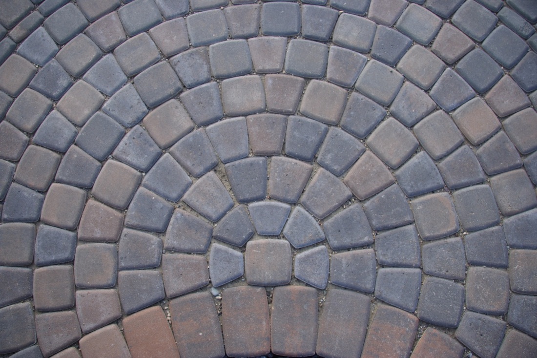
Repeated Bricks (1)
CloseUpsA good source of textures come from closeup photos of everyday objects. These can be used in creative ways to add tone and context to an image. Digital art can come across overly clean but real world textures can bring it back to reality.
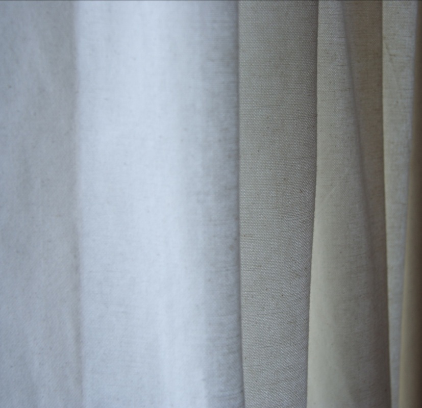
Drapes Closeup (1)
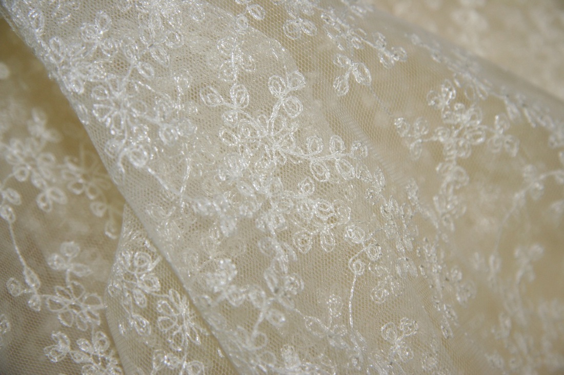
Fabric Closeup (1)
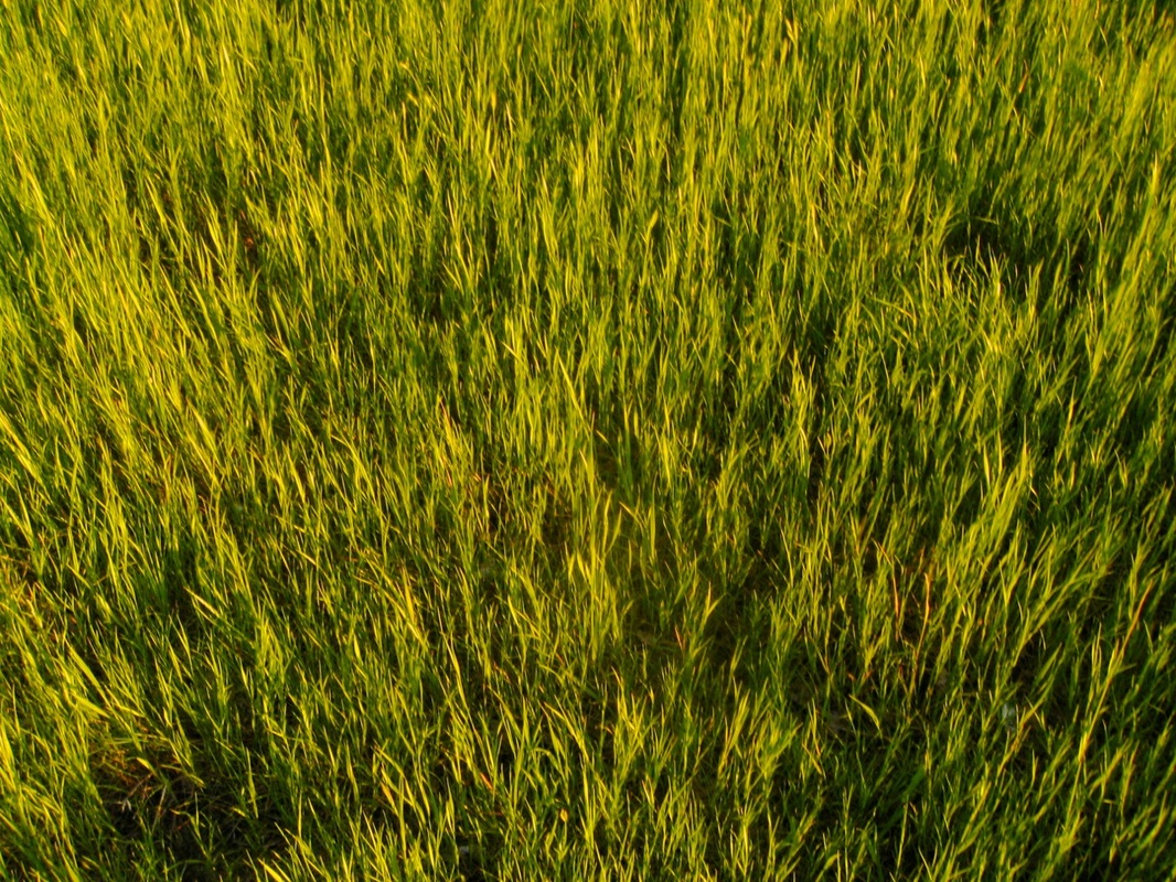
Grass Closeup (1)
Patterns
|
PurposeTextures provide contrast, richness, detail, realism and add tone to a New Media portrayal. It can also add a sense of depth to space.
Von Glitschka (n.d.) suggests that: Textures give humanity to digital art. 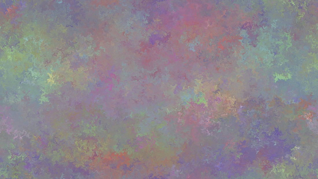
Painterly Texture (1)
Depth and ToneTextures can add more dimension and depth to an image. As an illustration, scan through the following slideshow to see how texture can communicate different qualities of tone and depth.
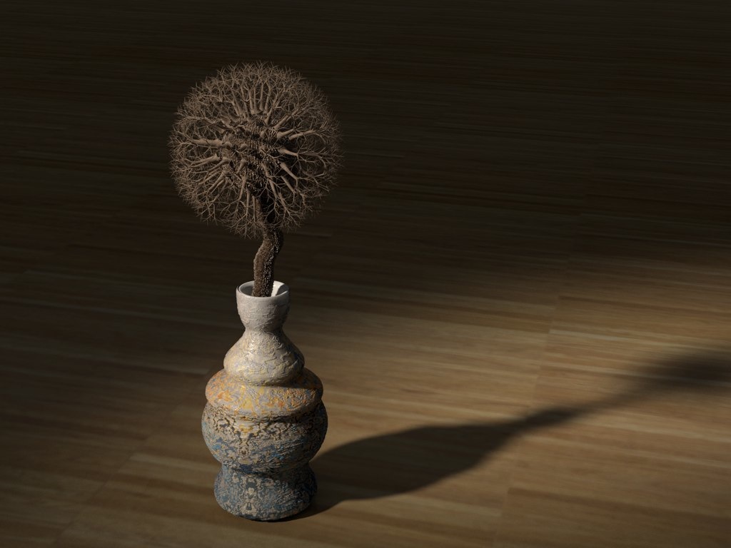
Consider how the following example uses texture to give the image an organic and natural feeling.
Texture Depth (1)
Consider how texture adds to the following image:
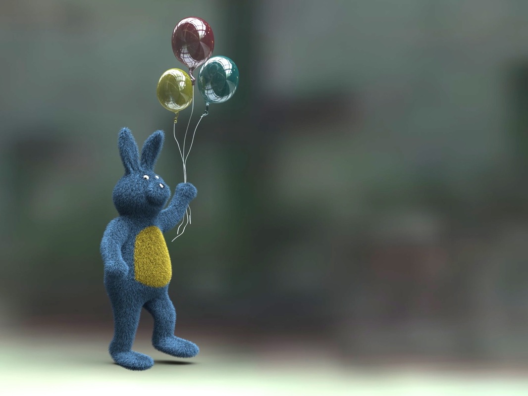
Furry Bunny and Glossy Balloons (1)
Seamless TilesSeamless textures are images that are mirrored in a way that give the impression those continue without edges. These are useful for creating background negative space or to be wrapped around a 3D object. These can be created with applications like Photoshop or Corel Painter. See the following image as an example seamless tile and then the next image as an example of how that original seamless tile can be used to create a seamless textures.
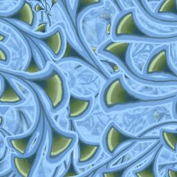
Seamless Tile (1)
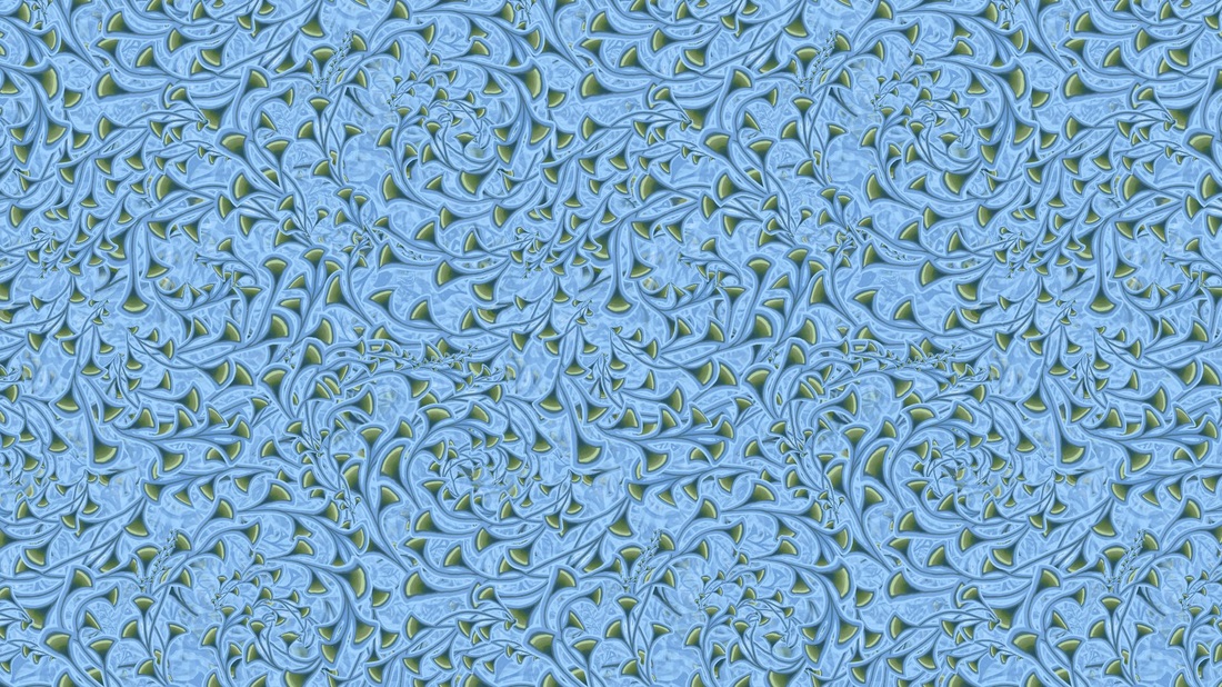
Image Created with Seamless Tile (1)
Texture DangersTextures need to be used with caution. One problem is if the texture is too large then it no longer fades into the background but competes with the foreground elements (Bennett, 2012).
Another potential problem is if a texture is a busy background it competes with the contrast of overlay text and makes it difficult to read. The image below demonstrates the problem: 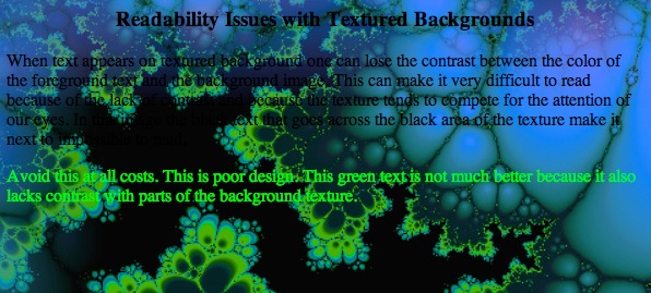
Texture Contrast Problem (1)
|
References
Bennett, J. G. (2012). Design fundamentals for New Media. 2nd Edition, Cengage Learning, New York, NY, USA.
Glitschka, Von. (n.d.). The creative spark: Von Blitschka, illustrative designer. Lynda.com. Retrieved from http://www.lynda.com/Design-Documentaries-tutorials/Creative-Spark-Von-Glitschka-Illustrative-Designer/129915-2.html
White, James. (2013). The creative spark: james White, visual artist and designer. Lynda.com. Retrieved from http://www.lynda.com/Design-Color-tutorials/Creative-Spark-James-White-Visual-Artist-Designer/139716-2.html