Colour
Background Colour Wheel Colour Wheel
Colour adds a dimension to composition that is significant. Colour haphazardly applied leaves the viewer confused. Colour is difficult because it is highly subjective and is often culturally and experientially different. (e.g white in western cultures suggests purity while in eastern cultures means death) (Adams, 2013; Begin, 2013).
Colour WheelThe colour wheel is a tool to help make the organization of colour easier to understand and can help determine colour pallet. Many graphic computer applications have a colour picker for selecting colour that either uses a colour wheel or a variation of it.
SaturationChroma/Saturation is the amount of Colour - the intensity of the colour. High chroma colours are more intense and give more contrast. Duller colours have a lower Chroma setting so tend to provide less contrast. Neutral mean lack of saturation.
Generally high chroma colours are more attention getting. ValueValue/Lightness refers to a colours brightness, Dark tend to stand out and lighter colours tend to recede into the background (e.g. pastel colours).
Variations in value add interest and can help give images dimension. The value of colour can also create a sense of hierarchy or weight - darker colours suggest higher order items - darker colours seem heavier than lighter colours (Caponigro, 2012). Try to think about value first before thinking about colour. The contrast between light and dark will be where the eye will gravitate to. Consider too how value impacts meaning or tone, see the slideshow below for an example. Colour TemperatureThe warmth of color can create an emotional response. For instance, a movie done in a blue tinge feels quite different from one done in sepia tones.
The following figure is how a color wheel might be roughly divided into cool and warm colours: 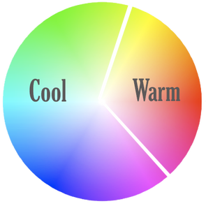
Colour Temperatures (1)
In addition, warmer colours tend to advance in space and cooler colours tend to recede in space (visually further away). See the following Figure as an example of this. How do you see depth in this image?

Depth with Colour (1)
MoodColour also communicates a mood. The following list illustrates the moods that are generally associated with colour - adapted from Lohr (2003). Caution, this categorization scheme may not apply to all contexts.
Colour Mood or Cultural Meaning Red
Orange
Yellow
Green
Blue
Violet
White
Black
Brown
Here is a good resource for more on colour and the meaning it communicates: Consider the implications of this on the MOOD BOARD and how this will link with the keywords associated with your storyline or message. Level of TransparencyAnother attribute of colour is the level of transparency. This makes the background show through the foreground colour. This can create a subtle blend on images and meaning and can create a sophisticated image suggesting a blending of meanings.
This technique can also be used to combat busy backgrounds when the background competes with the foreground subject. This relates to the concept of CONTRAST. |
PurposeColour has mutple purposes; it can create mood, depth, differentiate space or function (e.g. different categories).
Here is list of potential purposes of colour - adapted from Lohr (2003):
Colour can suggests linkage and sequence at the same time. Colur used in a rythym is a common device to highlight an important element in a series of otherwise unrelated images. Colour can also be used to tie disparate images together. Video and Photograph TipAlways check white balance settings on a camera to obtain realistic colouring of the image. If you want a special colouration to your photo do it as post processing task (e.g. use of Photoshop filter).
RulesThere are some rules that help the designer select colours that go well together. The following are a few of the common approaches:
Analogous The colour pallet is selected from the same side of the colour wheel (colours are beside each other). This can create a more harmonious feeling. 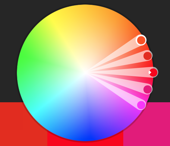
Complimentary
A complimentary colour palette comes from opposite sides of the colour wheel. This provides more contrast and suggest a more bold statement. 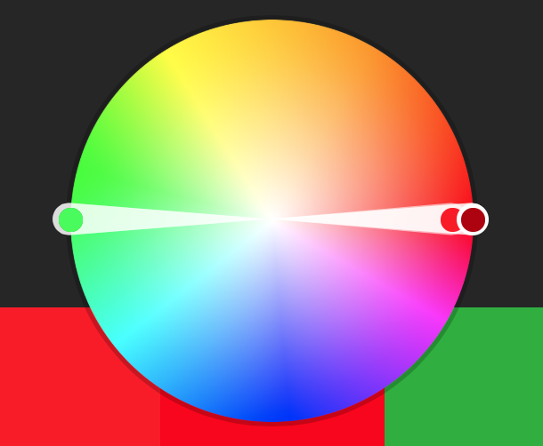
Triad
Triad colors come by dividing the colour wheel into thirds and colours are selected from the three sections. This creates quite bold contrasts and because more colours are added, it tends to liven up the message. 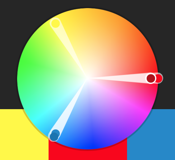
...and then there can be other rules that are variations on those themes. To get a better sense for these experiment with one of the colour tools below and try different rules.
Colour ChoicesThere should be purpose in the choice of colour and it shouldn't be guess work. Often the visual structure of ideas comes first then comes decisions about colour. Finally the subject matter, story or the message should guide the choice of colour. Consider the following heuristics when selecting colour:
ToolsThere are a number of tools for experimenting and coming up with colour palettes:
Use imbedded coloursAnother approach to selecting colour is to come up with a colour palette from off a relevant photo. Identify a photo that represents the concept. Most image editing software will allow a person to sample parts of the image and select colours based on those selections (eye dropper tool). Along these same lines, one can pixelate the photo to large pixels and then sample colour from the picture. The sampled colours can then become the palette for the design.
ResourcesBelow are links to additional sources of information about colour on the Web:
|
References
Adams, Sean. (2013). Foundations of Layout and Composition, Lynda.com. retrieved from http://www.lynda.com/Design-tutorials/Foundations-Layout-Composition/
Caponigro, John Paul. (2012). Color theory. Blog. retrieved from http://www.johnpaulcaponigro.com/blog/category/color-theory-color/
Lohr, L. L. (2003). Creating graphics for learning and performance: Lessons in visual literacy. Prentice Hall, NJ: Saddle River.
Begin, Mary Jane. (2013). Foundations of color. Lynda.com. Retrieved from http://www.lynda.com/Design-Color-tutorials/Foundations-Color/120601-2.html