Expressive Type Faces
BackgroundExpressive Typography is type that unique the graphic form that amplifies meaning. This section will explore not so much the semantic meaning of the text message (of course that is important) but the meaning of the visual look and feel of the type.
Type can act as a graphic element. Display or expressive type faces are designed to communicate particular kinds of ideas/moods through their graphic form and are often genre specific. For instance, here is type face called Omega Force - useful for futuristic concepts or science fiction:

Expressive TypographyDisplay type faces are for headers, titles or speciality callouts. These should be larger (14 point or larger) and can be serif or sans serif. However, a little goes a long way.
The advent of the computer has invoked new design power through an assortment of fonts and styles. The Figure below illustrates a few sample type faces. Consider how the shapes of these fonts communicate meaning. 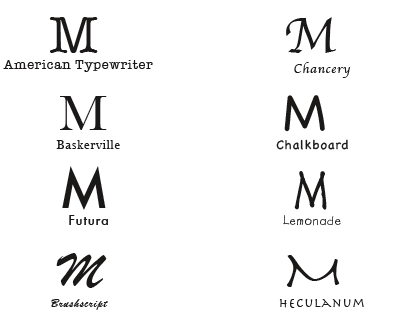
Under what circumstances would each of these fonts would be useful?
Let us deconstruct each of the font type faces above and examine how those could be used. Chalkboard might be a nice font to communicate an educational message because the mind links that to a chalkboard or whiteboard and that is associated with educational institutions. Lemonade type face, might be a good one to use when communicating ideas about kids because it looks like the kind of uneven print that kids would use. Herculanum has a bit of an ancient feel to it, so it might be a good font to communicate topics related to ancient civilizations. Brushscript and Chancery might be useful for expressing ideas about romance or formal invitations, this sense is evoked with the calligraphy like shape. Baskerville is very business like and stately, this is captured in the straight lines and in the contrast between the thin and thick lines. ...and so forth. How do we decide which font to use? The font should match the meaning (Lohr, 2003). The Figure below, is an example of a mismatch between the message and the font type face. 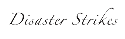
Here is another example, see Figure 8.

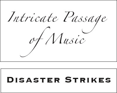
Swapping these two type faces brings the semantic meaning in harmony with the graphic connotation, see the Figure below.
Overuse
Speciality fonts are cool and the temptation might be to over use those. Too much of a good thing can be bad Often specialty fonts are difficult to read when used for longer sections of text. One reason is that the shapes of the letters are not quite what one expects (odd shaped font), it takes a bit longer to recognize, and that processing time is multiplied by the number of words. This becomes problematic when used in paragraphs of text because processing time goes up and viewer frustration increases. Limit speciality fonts or all caps for headers or titles. However there are times when such principles can be violated but with a purpose. See the Figure below for an example of excess use of expressive type face: 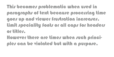
Use of expressive type faces is a balancing act between readability and legibility. |
PurposeExpressive type faces can enhance the message and can tell the story in emphatic or subtle ways.
Research on Specialized fontsResearchers found that special fonts helped learners retain information and discuss it in greater detail. They conclude that “More cognitive engagement leads to deeper processing, which facilitates encoding and subsequently better retrieval,” (Diemand-Yauman, et al., 2010).
Texture and Depth
Type can be combined with depth and texture to reinforce the information being communicated.
In the following slideshow, consider the mismatch the first image has with semantic understanding and the graphic form, compared to the second image: In the previous Figure the concept of metal is reinforced by the texture, colour, and sense of depth in the second image.
3D type: generally less is more, one or two words might be fine but the more effects you pile on the weaker the legibility will become. Mixing Type with GraphicsType is often juxtaposed with images. In fact Mayer (2009) found that meaningful text and graphics helped with comprehension and memory of the concepts. The type and the image should work together to communicate understanding (Landa, 1996). There should be a relationship between the two.
Take a look at the Figure below, from a critical perspective. What works and what doesn't, in terms of the type? 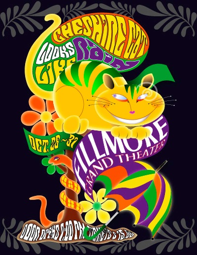
Legibility Versus Readability (4)
What works: The way the font flows into the shape of the images provides a nice way to squeeze the text into the image in an unobtrusive way. The choice of fonts seems appropriate and matches the theme. There is sufficient contrast between the type colour and the background. The focus of this image is on colour and shape, not on the text.
What doesn't work: There are so many contrasting elements the text becomes camouflaged. It is difficult for the eye to distinguish text from pictorial shapes. Further more, the text flows into odd angles and shapes making decreasing legibility. There are too many different shapes of textual elements, and each of those consume cognitive processing attention. This diversion of cognitive processes takes away from one of the image's intent - to communicate the details of the event. The viewer has to process the different font shapes and the curvature and angle of the text, chewing up more cognitive attention. Legibility is sacrificed for style. The lesson from this image is that as attributes are added to visual elements, it becomes more and more difficult to process, and at some point it will overwhelm cognitive capacity. Too much is usually worse that too little. Check out the Figure below. Does the type work for that image? 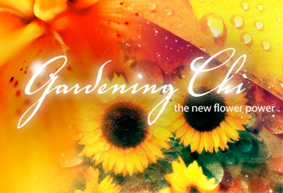
Harmony of Style (4)
One of the key aspects of the previous Figure is the relationship between the Font type face and the photographic elements, those seem to match. The photographic elements are warm and soothing and represent nature and the choice of type is flowing and curved in like manner matching the mood and content of the image.
Evaluate the Figure below. Can you read the word? How does that work? 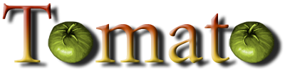
Creative Type Portrayals (4)
In the previous Figure, there are competing forms for cognitive attention; the tomatoes compete with the letter "o" for recognition. However, it is easy for most people to read this message and make the connection between the visual representation of a tomato and the letter "o". Why does it work? It works because the shapes are analogous, the shape of the tomato is the same as the shape of an "o" thus the mind can quickly substitute one for the other, almost automatically - a gestalt perception issue. Plus we tend to recognize words by shape and often don't see individual letters. Also notice that the choice of colours communicate an organic sense to the image (reds, yellows, and green). Harmony of images, tone, and meaning result in an effective visual.
|
References
Diemand-Yauman, C., Openheimer, D. M. and VAughn, E. B. (2010). Fortune favors the bold (and the Italicized) (2010): Effects of disfluency on educational outcomes. Cognition (2010), doi:10.1016/j.cognition.2010.09.012, Retrieved Mar. 11, 20111, from http://web.princeton.edu/sites/opplab/papers/Diemand-Yauman_Oppenheimer_2010.pdf
Landa, R. (1996). Graphic design. Albany, NY: Delmar.
Mayer, R. E. (2009). Multimedia learning (2nd ed). New York: Cambridge University Press.
Landa, R. (1996). Graphic design. Albany, NY: Delmar.
Mayer, R. E. (2009). Multimedia learning (2nd ed). New York: Cambridge University Press.